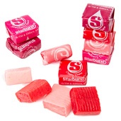
Think about your favorite flavor of candy. Is it strawberry or cherry? Is it sweet and fruity, rather than sour or tangy? Is it usually pink or red? For most, the answer to the questions above is a resounding “yes.”
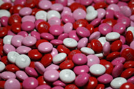
Sweets manufacturers are taking notice of the so-called “red bias” and are retooling their offerings to eliminate all other colors and flavors in their candy packaging. Starburst is a popular brand that listened to consumer preferences and launched its FaveReds product, which the company equates to “a mixtape of your favorite songs.” The candy packaging boasts a bold magenta hue and contains only strawberry, cherry, fruit punch, and watermelon flavored candies.
Color has an enormous impact on consumer purchasing decisions, and food and beverage companies should take this into consideration when branding their product packaging.
When companies change the color of their product or introduce new hues consumers don’t normally associate with their offerings, tastes and perceptions can change dramatically. Think about the Crystal Pepsi fiasco – the clear beverage didn’t look like the Pepsi customers knew and loved, and its marketing strategy flopped in a big way. Fortunately, the company was able to bounce back, but that may not always be the case for smaller brands.
 When it comes to preferred colors, like reds and pinks, brands should consider the emotional response these hues evoke in customers when designing their food or candy packaging. Red is an intense shade, the color of blood and fire, which many have associated with energy, strength, and power for centuries. Red and pink are also related to feelings of love and passion. Using red on your product packaging grabs shoppers’ attention quickly – think about how often it’s used to denote “DANGER” on warning labels or signs. Stop signs are red for a reason, after all.
Consumers prefer the taste of sweet, fruity, red-flavored candies partly because they’re less acidic and sour than flavors colored yellow or green. They associate color with flavor, so using hues that conjure up the taste of your product on your candy packaging can lure shoppers in. Introducing “all-red” varieties is a smart move as well because it allows your brand to try new things and test consumer response.
Working with a packaging supplier that partners with you to produce a quick turnaround for your candy packaging is important.
Holidays are perfect for launching new red or pink varieties of your sweet snacks – think about the colors associated with Valentine’s Day and Christmas – so your packaging supplier should be able to ship your newly designed red packaging quickly. This way, you can approve it and get it in retail shelves on time. Choosing digital printed prototypes allows manufacturers to check out the look and feel of their packaging quickly so they can launch new offerings that appeal to customers’ wants and needs. Printed packaging prototypes are available in clear, metalized, and foil laminate material – all of which lend well to eye-catching colors and graphics.
Related Posts: