You may be familiar with the controversial “Women’s Tax,” also called the “Pink Tax,” where products marketed specifically toward female shoppers are more expensive than goods aimed toward their male counterparts.
Brands are making strides against this unfair marketing and pricing structure, with companies like Target eliminating gender-based signs in its stores and unisex cosmetics emerging on the market. Still, it’s obvious that much progress still needs to be made in terms of developing and advertising products that are inclusive and not unfairly priced because of flowery graphics and colors aimed toward the female gender.Interestingly, a new report shows stereotypically gendered packaging might not be so bad after all. Confused? Let’s explore the reasons why consumers might actually prefer “pink is for girls, blue is for boys” branding: People becsome wary of companies that stray from convention. Whether they’ve simply become conditioned to seek out certain colors and designs that they feel represents them as a customer, or they truly do prefer if a product looks “masculine” or “feminine,” this type of branding does help distinguish products from one another, and customers can easily find it, recognize it, and know it is conducive to their specific needs and lifestyles. However, think about the big picture here – companies do not have to rely on clichéd and outdated gender stereotypes to become identifiable on store shelves. Putting a little extra effort and thought into your product packaging design can help change consumer belief and perception about a product for the better, and it has the potential to create lasting change that can propel society forward.
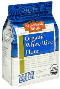
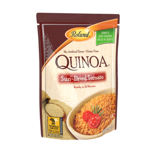
 In the report mentioned above, the majority of respondents also claimed that food marketed as healthy and wholesome was decidedly more feminine, whereas unhealthy food was seen as more appealing to the male consumer. This illustrates the point, perhaps, that people are conditioned to believe healthy foods have a certain look and feel, and they expect the packaging to appear natural and subdued. Primary colors are often associated with candy, junk food, and products developed for children. Brands that specialize in healthy products can help shape and shift these perceptions by packaging their product in kraft stand up pouches and other bags that are environmentally friendly and, generally, gender neutral. It’s great if your target customer is of a certain specific demographic, but to appeal to a larger audience, it’s important to get the colors, design, branding, and packaging structure right.
Suppliers and successful producers alike know that packaging nutritious food in flimsy containers that rip, tear, and result in spoilage and waste just doesn’t make sense.
Packaging healthy products in puncture resistant, recyclable pouches and bags sends a message to consumers that the food inside is fresh, well protected, and produced sustainably with earthy ingredients. The packaging industry truly has power to reshape consumer perception of products, and brands that work closely with a supplier to design the way their products are presented can help draw in a whole new consumer base.
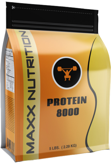
Despite what new research shows, companies don’t have to result in trite packaging design schemes like pink and “girl power” phrases for women, nor do they have to stick with “macho” product names and graphics to specifically target men. Words and images on your product packaging can make all the difference in how food is perceived – even its taste, the quality of product, and consumers’ opinions about your company. Food brands are already knocking down archaic stereotypes with packaging designs that have widespread appeal.
Beef jerky is a great example of a product that has traditionally been marketed to men using dark colors, bold text, and rugged graphics on its product packaging. Now, jerky brands are retooling their food packaging to promote their product as healthy and appealing to all consumers. No matter what goods your brand has out on the market, packaging is the first and easiest step toward shaping consumer awareness and drawing them in using graphics, branding, wording, and overall design to appeal to many rather than keeping specific shoppers in an antiquated box. The key is making your product recognizable in creative, innovative ways so shoppers don’t have to rely on outdated gender stereotyping.
(Image Source: www.patheos.com, theotherblog.org)